New Releases
New

Tuft the World
$25.95
New

Forest
$18.99
New

New

Thinking with Type
$29.95
New

Unruly Figures
$24.95
Coming Soon

Everyone Gets a Turn
$18.99
New

New


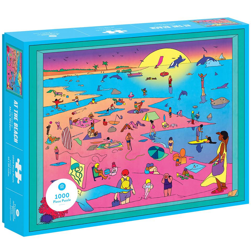
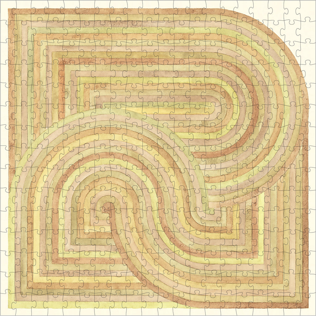
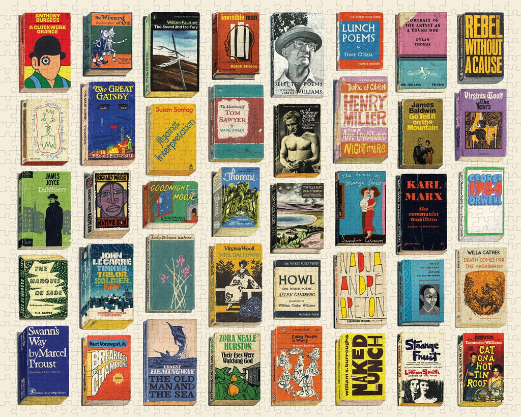
Puzzles

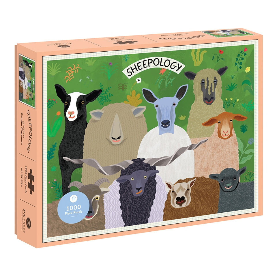
Sheepology 1000-Piece Puzzle
$17.95

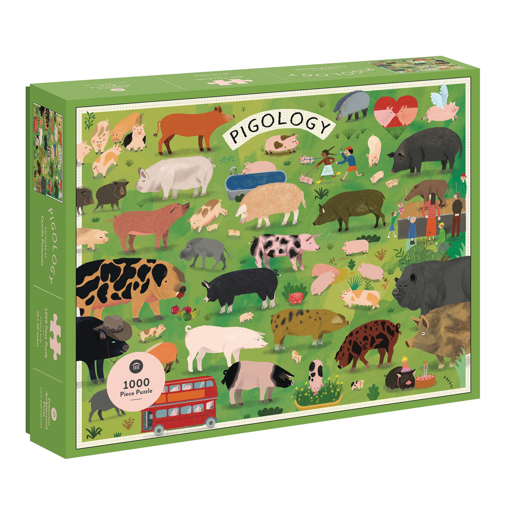

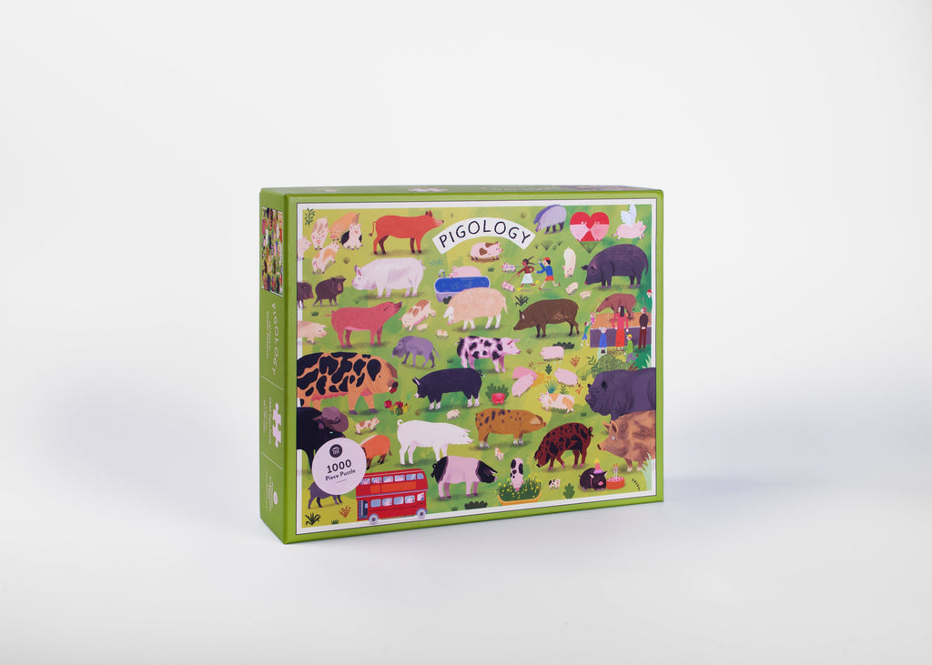
Pigology 1000 Piece Puzzle
$17.95


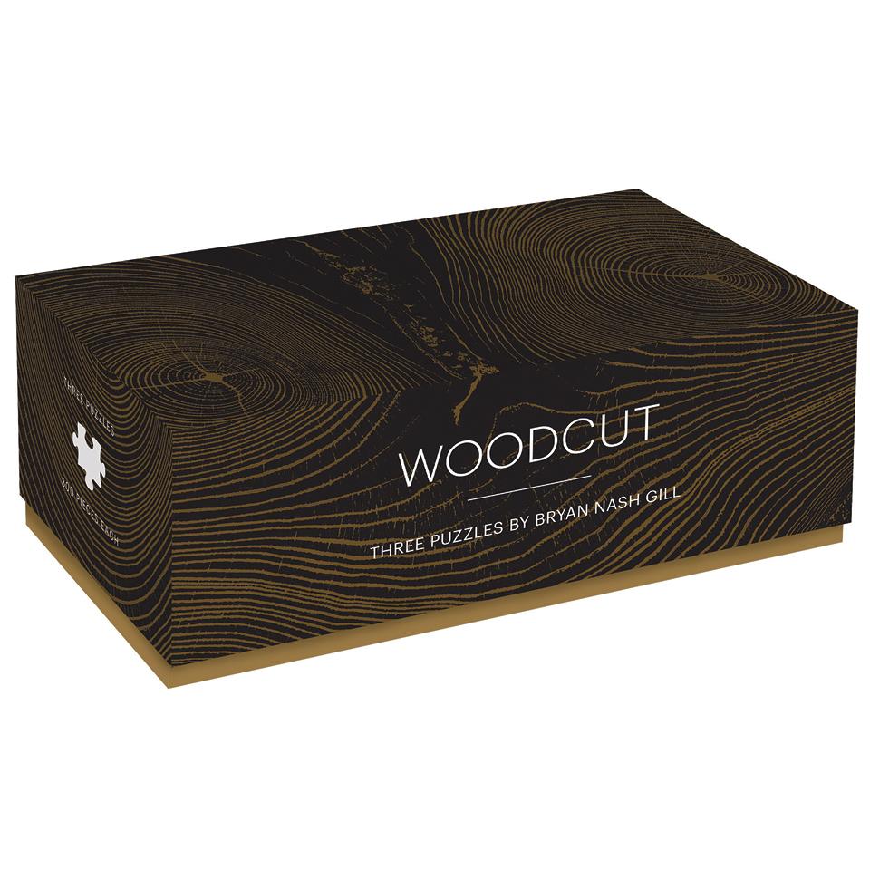

Woodcut: Three Puzzles
$29.95

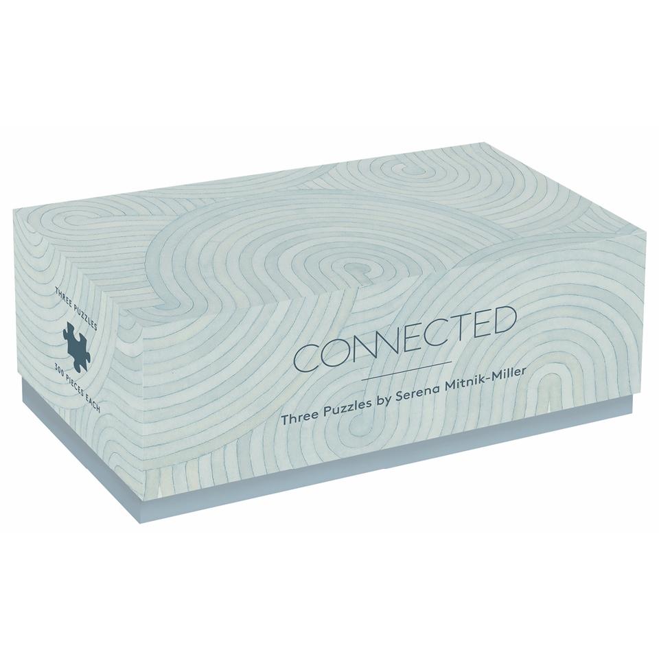

Connected: Three Puzzles
$29.95


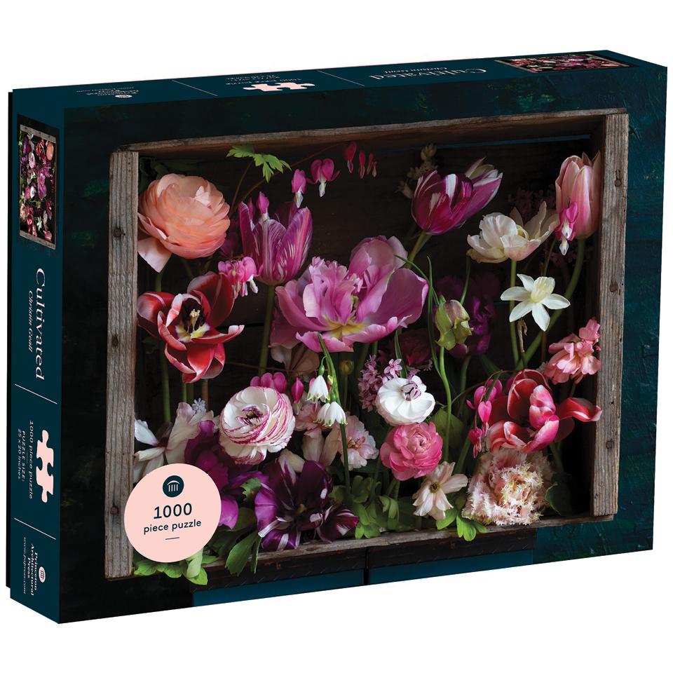

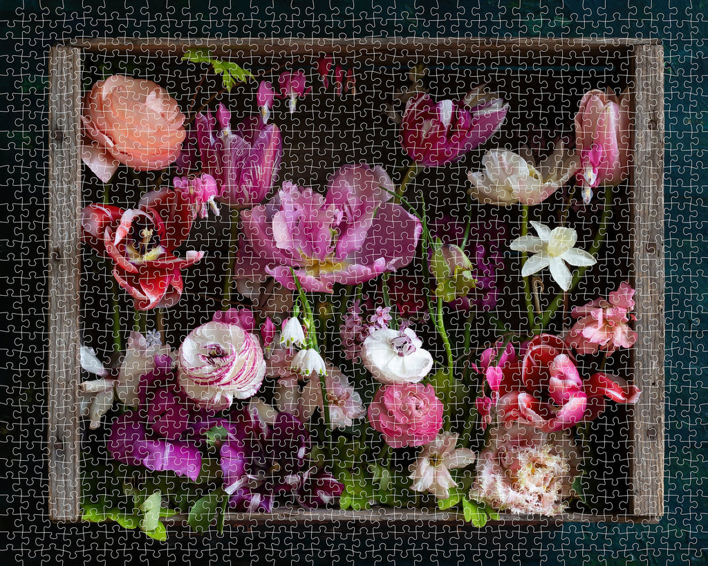
Cultivated 1000 Piece Puzzle
$16.95
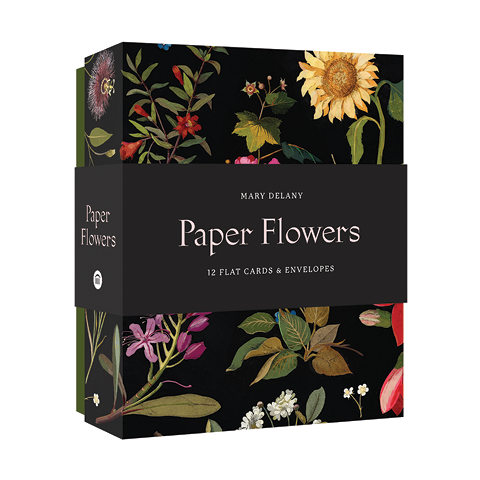
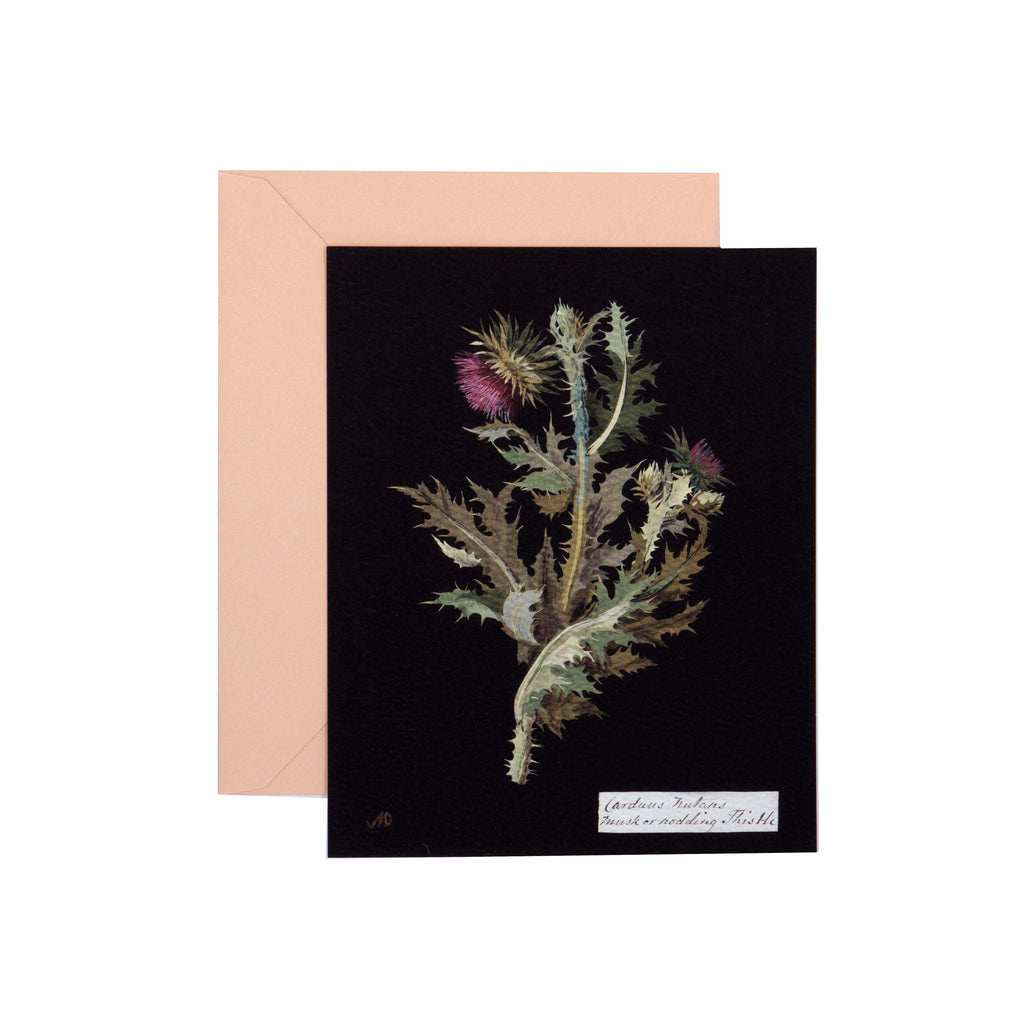
Paper + Goods

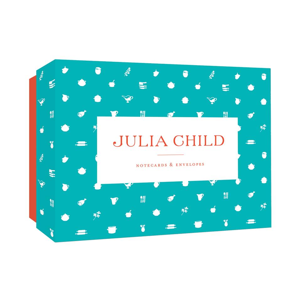

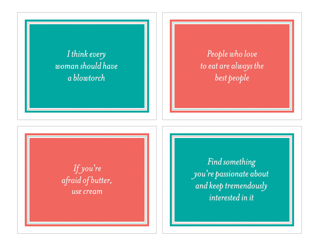
Julia Child Notecards
$15.95


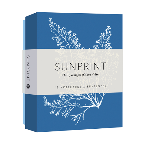

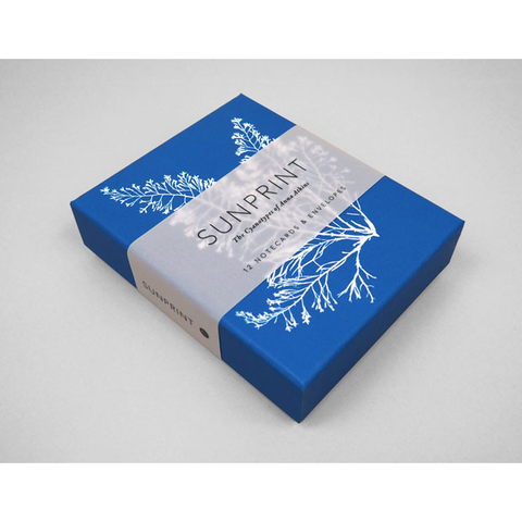
Sunprint Notecards
$16.95

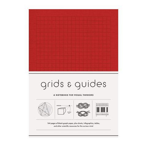

Grids & Guides (Red)
$18.95

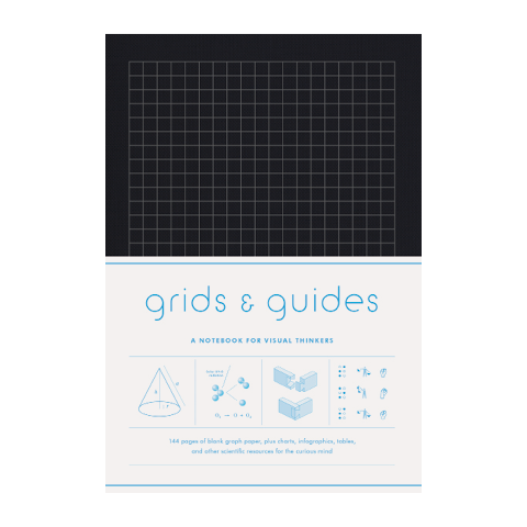


Grids & Guides (Black)
$18.95

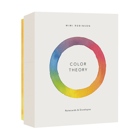

Color Theory Notecards
$16.95

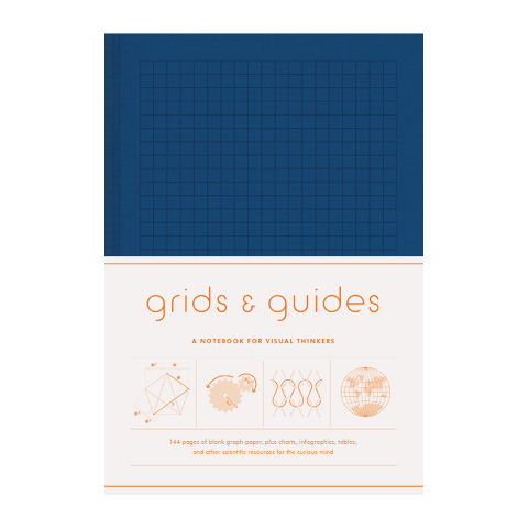

Grids & Guides (Navy)
$16.95
Sold Out
Sold Out

Children's Books
New
Forest
$18.99
Coming Soon
Everyone Gets a Turn
$18.99

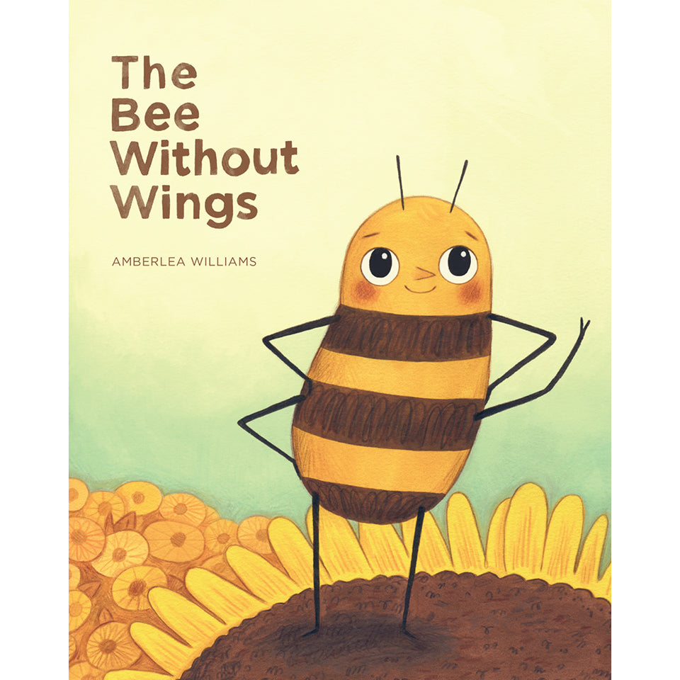
The Bee Without Wings
$18.99
Sold Out
Sold Out

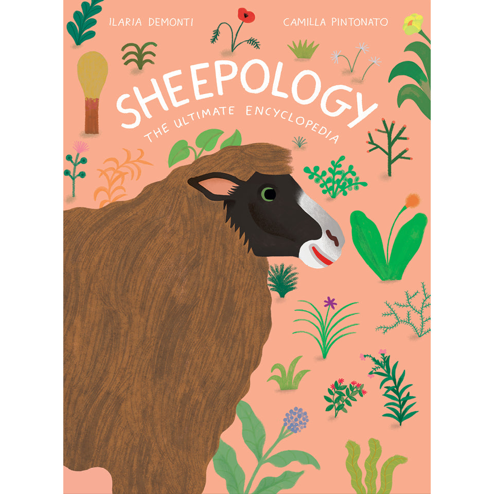
Sheepology
$19.99

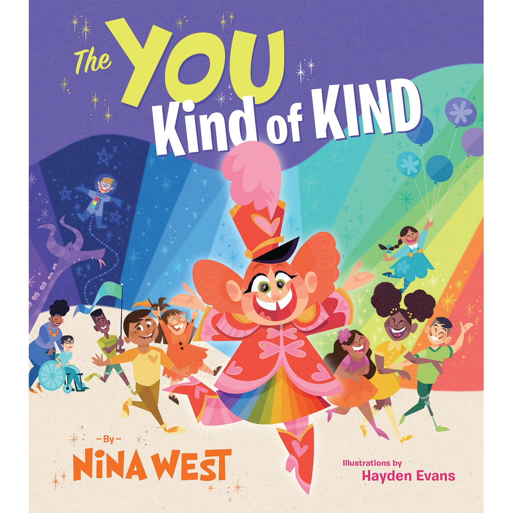
The You Kind of Kind
$18.99

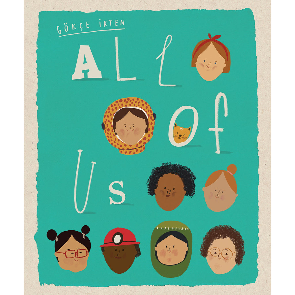
All of Us
$18.99

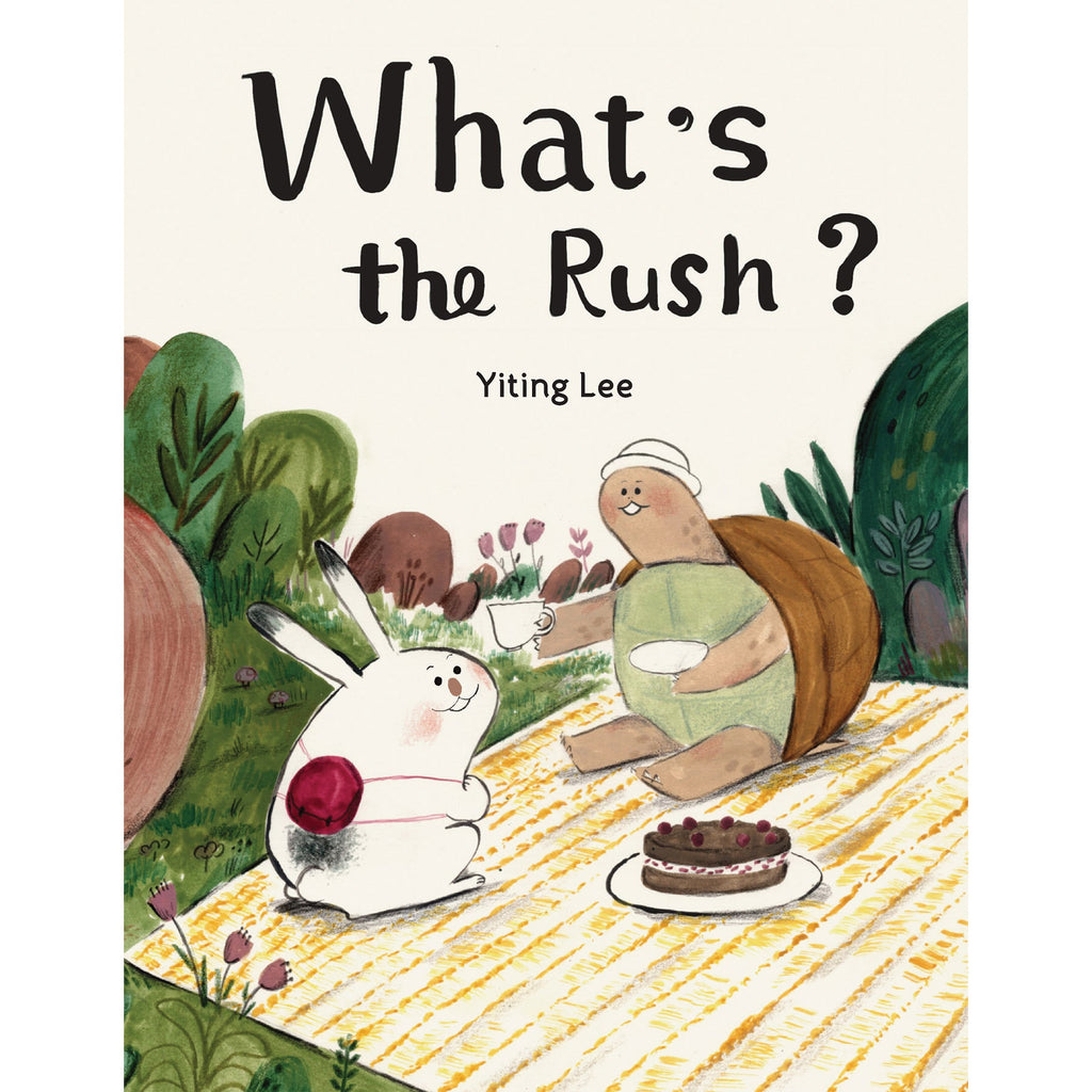
What's the Rush?
$18.99